Monitor Dashboard UI Enhancements
Here are some UI enhancements we published today.
-
1. Moved Rename Monitor to Dialog
We removed the in-place editor for monitor names. While it was the fastest way to rename a monitor, it made the UI clunky. The edit button used to appear next to a monitor's name when you hovered over it. This made the name column grow in size pushing all the other columns to the right. Again, when you moved your mouse out of the monitor's name column, the edit button would disappear and the column's width would decrease. This created a terrible flickering effect as you moved your mouse across monitors.
Instead, we now have the Rename action available as a drop down menu item of the three dots button at the extreme right of each monitor.
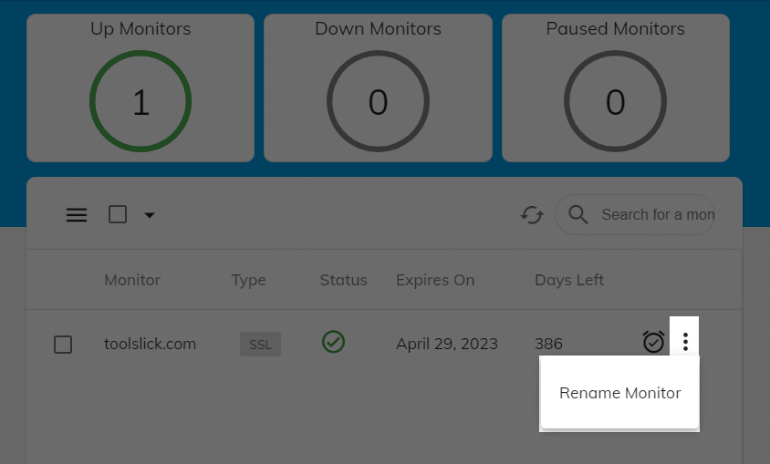
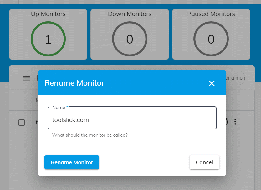
And it opens a dialog from where you can either change the name or cancel the rename.
-
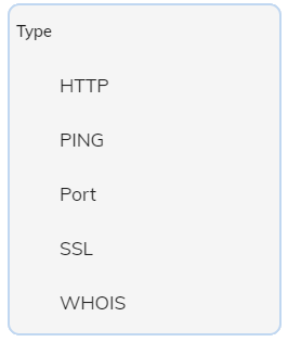
2. Re-arranged the order of Monitor Types
We moved the frequently used ones such as SSL and WHOIS a bit up while demoting the ones such as DNS & NameCheap.
-
3. Filter Monitors using the Counters
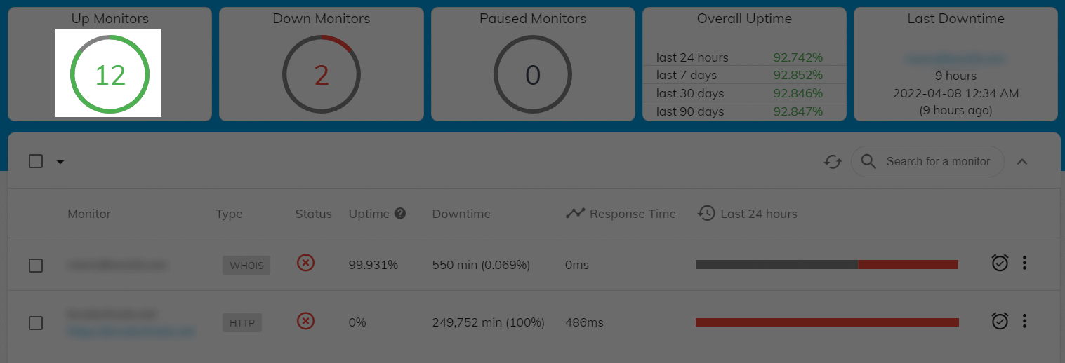
Now you can click on the top counters (circles showing how many monitors are Up/Down/Paused) to filter the monitors by their status. This is more intuitive and an expected behavior by users.
-
4. Collapsible Header
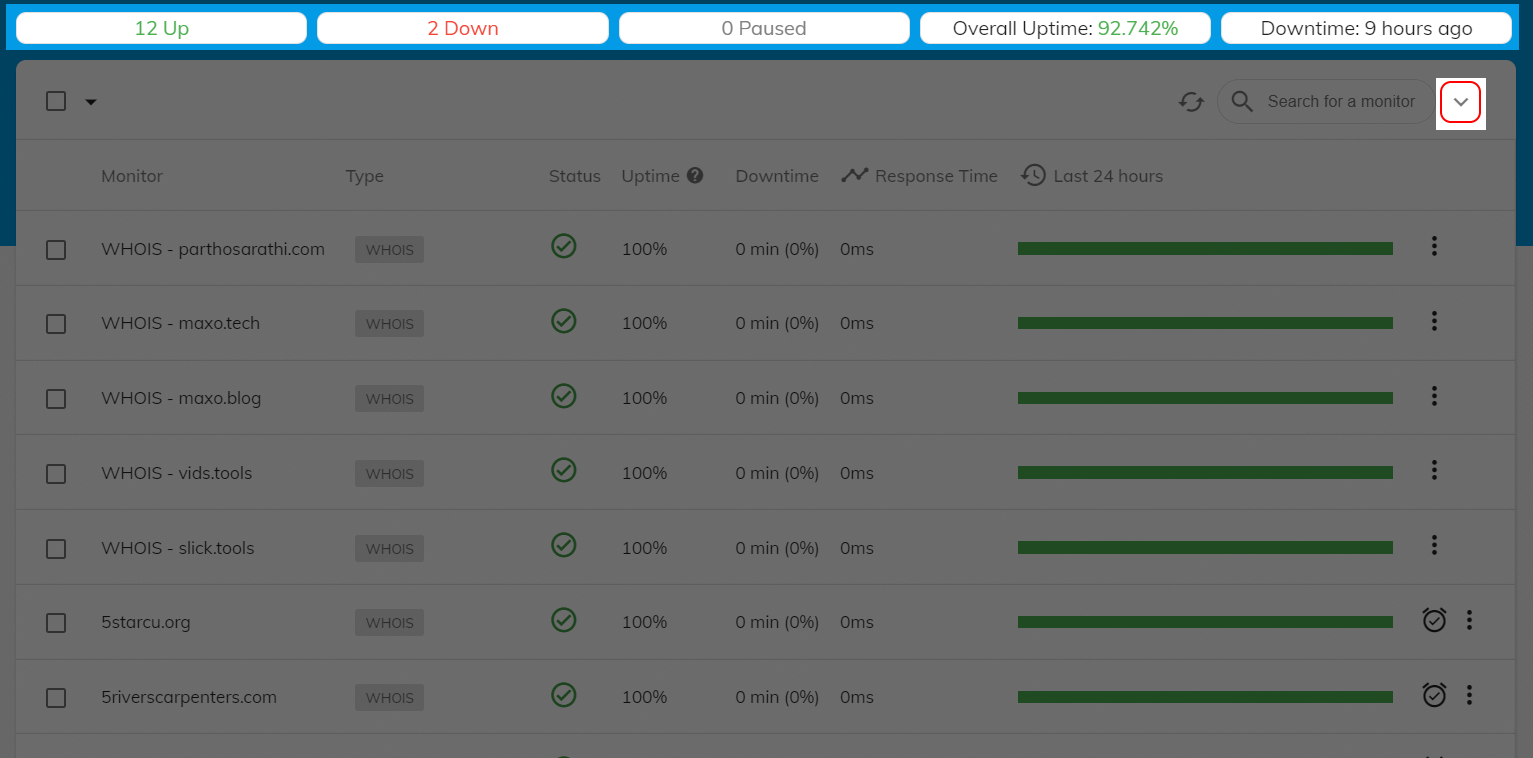
Which brings us to the coolest UI enhancement. You can collapse the header to make it more compact. This allows more monitors to be shown in the list. While still showing the same overall metrics. Use the Expand/Collapse button to the right of Search for a monitor text box.
-
5. Search Monitors by Name
Our monitor search worked on the browser side i.e only within the page of monitors currently visible. Now the search happens on the server side and you can search across all your monitors.

-
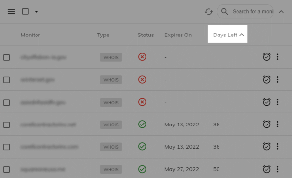
6. Sort Monitors
Monitor list is now fully sortable. Click on a column header to toggle sorting between Ascending, Descending & None. SSL and WHOIS monitor filters have a default ascending sorting on the Days Left column.
